Over the many years that we have been providing you news, reviews and applications, we have seen some pretty amazing things. We saw
home replacement apps take over our devices, replacing the boring versions or custom-built OEM ones entirely. Often offering new visuals, new widgets and a plethora of settings. It didn’t take long for themers to come out of the woodwork to enhance the look of these applications. When I think of home launchers my mind defaults to the big boys,
ADW Launcher EX,
Launcher Pro and
GO Launcher EX. Even though they all have their pros and cons, each one is still fairly similar. So I set out on a mission to find something new and unusual to show you guys. In my pursuit I installed 8 new home launchers and 35 new applications. Glad I was on Wi-Fi. Out of all the launchers I installed two really stood out as unique and we are going to show you one of them right now.
The new home replacement is called aShell Home Screen Launcher. It has been created by Mobilityflow DMD. They are mostly known for creating some pretty cool shadow dancer live wallpapers and their Animated Weather Widget and  Clock. They have recently stepped away from that genre of apps and started development on a launcher that has a lot of potential. It is still labeled as a PRE BETA version of the app. They fully expect to hear about bugs and are dedicated to adding new features that they want as well as ones you request.
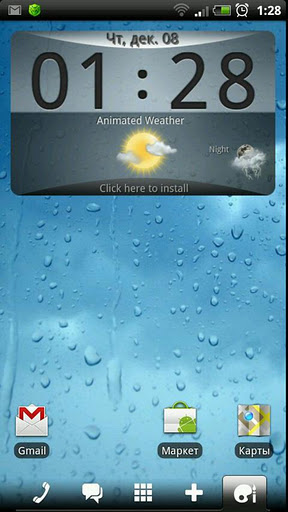
When you look at the main home screen you don’t see anything that outstanding. It offers a good-looking weather/clock widget which was created by them as well. That app is in the market for purchase and if you wish to use it in the launcher you will need to do so. Other wise you can delete it like normal ans use your preferred widget. The launcher offers the tradition app drawer settings, home screen settings, transition effects and all the general goodies that the competitors offer. I have no intention of wasting a bunch of your time talking about redundant features.
What I will do though is tell you why you should check out this launcher for your self and what makes this different from the other guys. Located at the bottom of your screen is the all important launcher dock. You have your phone, messages, app drawer and nifty little paint palette and brush icon. Each one opens up the application it is associated too. Again, nothing new. But when you drag your finger up from each icon is completely new and different. Take a look at each below –
Phone – When you drag the phone icon up, you have instant access to your current call log. The list is fully scrollable and can be pulled up as part way or all the way to the top of the screen. If you pull it all the way to the top, you can filter the calls out with quick filter buttons for incoming, outgoing, missed or all calls. Across the top of the call log you cal scroll left or right to a contact that you have recently called or received a call from. Tapping on their associated photo calls that person instantly.
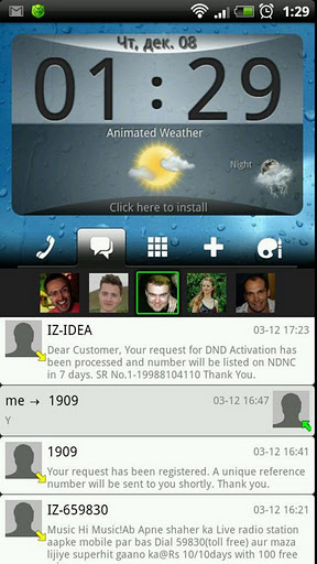
Messages – Pulling this icon up provides similar functionality as the call log. You can instantly click a photo to send that person a text message, tap a message to reply, and scroll through your entire message history. Also, if you pull the tab to the top of the screen you can filter by incoming, outgoing or all messages.
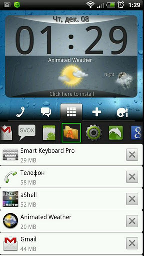
 App Drawer
 – When you pull up the app drawer icon you get a list of your running apps. You can scroll though the list from left to right at the top or pull it up further for a complete list with X boxes to kill the application. Essentially it is a task manager that keeps you from having to long press the home key or open another application to switch or kill a process.
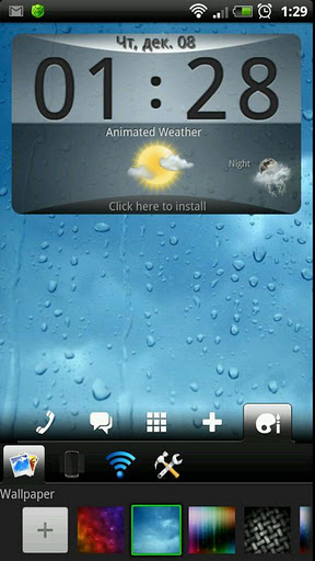
 Palette
 – I am not entirely sure what else to call this icon since what it does is so wide-spread. When this icon tab is dragged up you get access to five quick actions. The first will let you quickly change the wallpaper from one that are prebuilt into the launcher app. you can also hit the + button and add more of your favorite wallpapers to the list. The second action lets you change the screen transition effects. Every one you tap on makes the home screen provide you a preview of the transition. In the middle you have a quick place to turn your Wi-Fi and Bluetooth on and off. THe forth icon gives you a set of settings that you will probably only use once, changing the launcher sound effects volume and if you want the vibration effects on or off. The final quick access icon gives you quick access to your devices volume and ringtone settings, standard settings, application management and the aShell settings menu.

Even though this application is still labeled as a PRE BETA build, it seems to work rather well as is so far for me. Having those awesome quick tab access points really makes this thing stand out as not only useful, but different what you are all currently used to using. It is free in the market for you to test out and comment on. Be sure to make comments and recommendations toÂ
Mobilityflow DMDÂ so they can improve this launcher. I think once they get themes enabled on it, and a little more personal customization additions added, it could easily compete with the big dogs. You can pick it up by scanning or clinking the QR code below as usual. Let us know what you think of it!
Application:Â aShell Home Screen Replacement
Developer:Â Mobilityflow DMD
Cost:Â FREE

