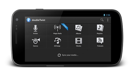
The team at doubleTwist updated its music player, bringing some Holo design changes and some tweaks to functionality. The interface changes were relatively minor, adding some alterations to navigation and page layout.
Primary navigation occurs with the Up button and the system action bar is used for switching between pages. Many of the functions used for navigating menus remain the same for settings, playlists, etc.
In addition, the app brings a series of new screens that work in both portrait and landscape, with some different layout options.
The team paid particular attention to design detail. Everything from colors, layout and typography were “completely redesigned to be Holo-compliant.”
The color scheme mixes dark elements and a clean layout into its interface, with highlights to text elements.


