When Lenovo released the Yoga 8 and the Yoga 10 there wasn’t a heck of a lot of excitement around them. The specs weren’t “top-tier” and the screen resolution of both tablet were the same, 1280 x 800. Needless to say, that resolution looked just fine on the Yoga 8, but the larger Yoga 10.1 looked pretty pixelated. At $259.00 (currently) and battery life hitting the 18 hour marker for just usage, I felt it was a great deal anyways. Although I did wish, and so did many others, that the screen was a bit more hi-res. Lenovo heard the cries and have since released a revamped version of the tablet with a follow-up version, the Yoga 10.1 HD+.
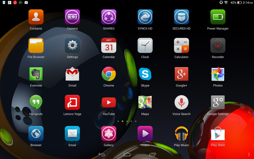
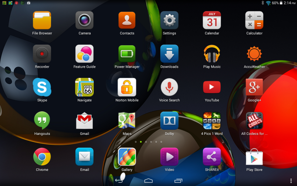
Quite a few things changed in the HD+ variant besides just the screen. The overall tablet has a number of external differences as well as a couple internal changes. On the screen side of things though they kicked it up from the 1200 x 800 resolution to 1920 x 1200. As you can see in the image below, it is a drastic improvement to how to it looks. Everything is much more crisp and arguably, this is exactly what they should have launched the first time around. Not sure if you can see the difference between the screenshots or not, but hopefully you can.
Yoga 10.1 HD+Â screenshot
Yoga 10.1 first version tablet screenshot
Moving along though, we can see that the rear stand has also changed. It is slightly thicker and is a bit longer. This helps the balance of the tablet when in stand mode and gives you a bit more flexibility with angles that you couldn’t so easily achieve with the shorter, more stubby, stand on the original Yoga 10.1. It also lets it sit a bit more vertical than its predecessor and gives it a better center of gravity to allow for more viewing angles without toppling.
Yoga 10 HD+ sitting to the right.
Under the stand, where the SD card goes, they have incorporate a door that covers the slot. It is just a thin strip of plastic that clicks into place. It is a nice addition, but not all that necessary in my book.
The HD+ power button that is found on the site is also much stiffer. You don’t have to press it in as far to get the tablet to turn on and off. You can also the camera difference simply from the outside. The original offered a 5MP where as the newer one offers an 8MP.
Internally the processor was also changed out. They moved from the MediaTech 1.2GHz quad-core processor to a Qualcomm 400 quad-core 1.60GHz processor. Lenovo also doubled up from the 1Gb of RAM to 2GB of RAM. Even with all the changes, the tablet only gained a small amount of weight going from 1.3 pounds to 1.38 pounds. Having the unique ability to have both the new and old tablet on hand, I can tell you that I can’t feel the weight difference at all.
Sound:
I do have to touch on the sound simply because the tablet boasts the Dolby Digital Surround sound branding, software and dual front facing speakers. The original Yoga 10 also offered the same thing. Interestingly enough, the sound is dramatically improved on the HD+. Like, night and day different even without toggling any of the Dolby settings.
Other Software Enhancements
Software wise they also made a few changes. The HD+ is still on Android started out on Android 4.2 but received an update to Android 4.4 fairly recently.  A new multi-window function has been added  to the HD+ base software. It is pretty cool, even though a little laggy. To use it you just tap on your multitask button at the bottom, then you can drag up your most recent apps and create up to 4 panes. You can also hit the small icon on the top right of the list and drag specific apps up.
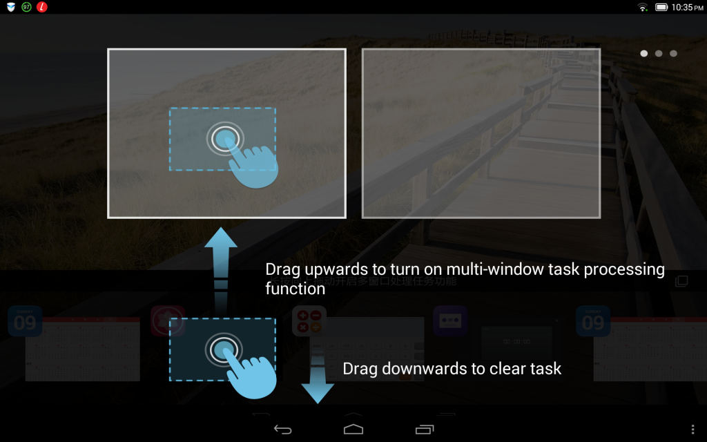
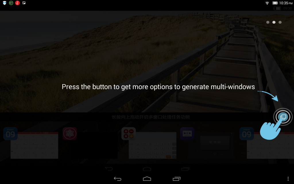
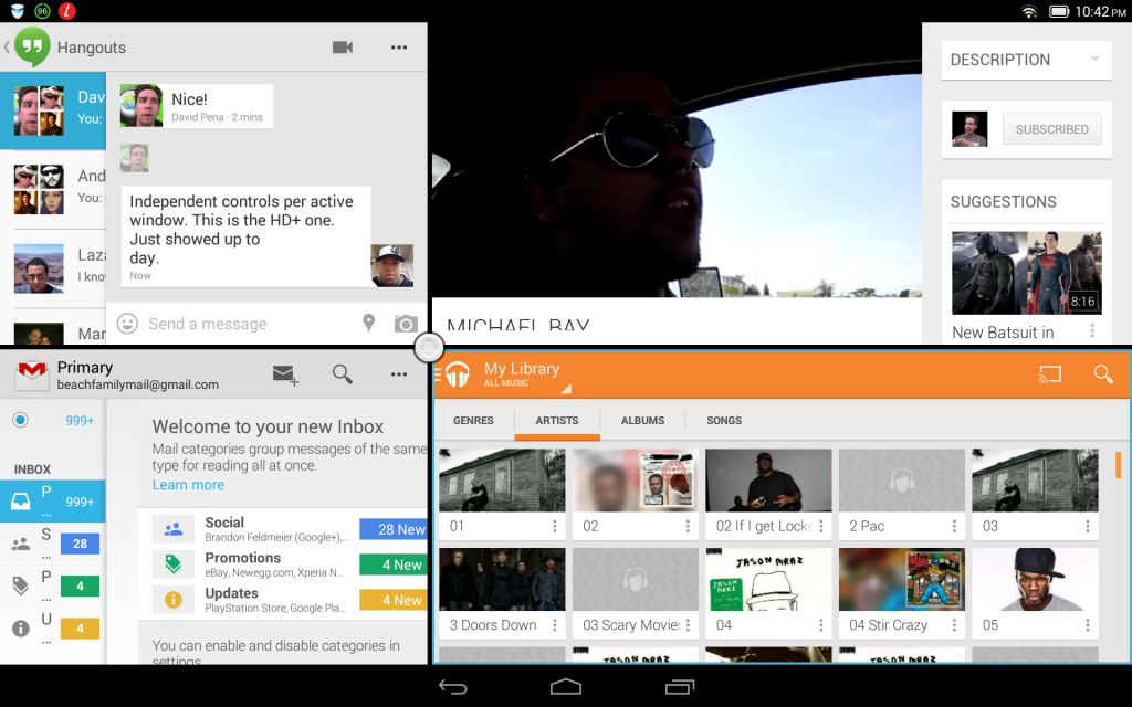
You can long press on that center button and resize in any direction based on your needs. A quick tap on it provides you options to close individual panes, add a pane or enlarge a specific pane that is active. The active pane has a blue outline around it and can be controlled independently from the rest. Meaning you can have music playing and a YouTube video streaming while writing an email. If you do so desire.
Lenovo also made a few icon design changes and included a few other apps like SECUREit HD. It is essentially a security app that lets you free up device memory, block ads, manage your apps, and set individual permissions per app on the device.
Do the upgrades make it better or worse?
That is a fairly tricky question. One would think that a switch to a Qualcomm processor and doubling the RAM would have a significant improvement in operations. While I am still getting the same great battery life, the tablet has some noticeable lag between screens, apps and during the multi-window use. I was kind of expecting it, so I wasn’t all that surprised. The build quality, design and look are fantastic and have always been something that I loved about most Lenovo products. There have been a few questionable devices in my day that I have seen. Even with the clunky skin and the noticeable lag issues, it performs well. By that I mean that after your game or app is open things run pretty smoothly. A few changes in the developer settings and a new home replacements, like Nova, makes things a little better.
Overall thoughts on the Lenovo Yoga 10.1 HD+ and tablets in general
I have always felt that a tablet is purchased for a specific purpose or need for the user’s life. The Yoga line isn’t out there to compete with the Note Pro or the iPads. It is out there to compete in the mid-range market for users who are more media centric and is geared more towards watching movies, TV shows, reading books and casual browsing. In my case, the tablet has been used on a number of road trips for the kids to watch movies and for playing some Battlefield 4 Commander late at night in my bed. The battery life shines and easily makes it a day or longer depending on your use. Â Having the SD card slots makes it easy to load it up with plenty of movies and books for ages. Not to mention the tablets internal storage is 32GB out the gate. I don’t feel the stand is gimmicky at all. It is actually extremely useful and takes the “holding” out of the picture.
As for the price tag, Lenovo has it set at $349.99 right now directly through Lenovo. It is well worth that price tag for the right individual. Those looking for a bigger screen for media uses, car trips, plane rides and more that don’t need or want something lightning fast that dies 5 hours into the day.
