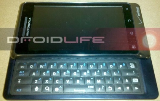
We’ve all been waiting for more information on the top secret Motorola Droid 2. Â We now have some new information for you as I managed to get my hands on the new device for a short time. Unfortunately, I was not allowed to take any photos. Â You’ll just have to use the photo from DroidLife as the only reference. Â I can confirm that the photo above is the same as the Droid 2 I had my hands on.
The first comment I have to make is that this device is heavy, very heavy.  I’m not sure if I’d want this device in my pocket without a good belt on my trousers.  There is a fine line between having a new device with a high quality build level and having something that is easy to carry around.  The device is incredibly solid and an obviously solid metal frame.  From what I could tell most of the outer shell of the device is metal.  The back of the phone is a very dark blue and almost appeared black and the front bezel is a gun metal grey.
I have to say that the device looked and felt very nice, but is it something that would make me go and swap over to Verizon, probably not. Â It doesn’t appear to be a huge leap forward from the original Droid and in some respects, seems to be a backward step.
The device has no trackball function at all, instead they have opted to place cursor keys on the right hand side of the hardware keyboard for navigation.  The keyboard itself does feel a little nicer than the original Droid.  The keys feel easier to press with a positive feel when they are pressed.  I found the original Droid keys hard to press, but keyboards are a personal preference and many people liked the original.  They also changed the position of the shortcut keys on the front face, so people use to the original Droid will probably start off pressing the wrong keys.  The original Droid order was Back, Menu, Home  and Search and the new Droid 2 is Menu, Home, Back and Search.
Moto Blur has definitely been enhanced from the earlier versions and can almost be completely removed by not using the Blur widgets. It felt more like some pretty cool add-ons to the standard Android experience rather than taking over the phone completely.
The camera takes excellent pictures, but so did the original Droid. Is this a revolutionary step forward?  The camera software is very easy to use, using an overlay system that allows you to swipe over the screen to change the effects and features.  The camera also has a multi shot feature taking 6 shots in succession so you don’t miss anything.
Overall, the build quality felt excellent but also made the device very heavy.  The software enhancements are what appeared to be its progress from the original Droid but this is something that could have been rolled out to the original Droid to give the same experience.
In conclusion, the phone is nice but hardware-wise doesn’t seem to be anything too revolutionary over the original Droid and there was nothing that it made it feel like a significant upgrade that would make current Droid owners want to upgrade, except possibly the software.
I really only played with the device for a few minutes so don’t take this as a complete preview and bear in mind that the unit was a user test device so the final product could possibly be enhanced a little, but probably only on the software front.

