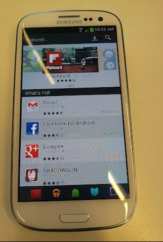
The image you see above was released on the HD blog website and shows us a different layout then we currently are used to. Things that we notice right of the bat is the navigation ribbon at the bottom. Showing Play Movies, Play Music and Play Books.  We also see an Android icon in the middle which could be for generalized apps. We can’t quite determine what the icon on the far left is though thanks to that glare from the lights, but it looks like it should be for devices.  You can see the layout looks more like the old market then the current Play Store we see today. We also see in the top left ‘Featured’, that is pretty self explanatory, but it could house a drop down menu to pick and choose different areas. We also see a small color coded ribbon between the black space and the white space at the top. Following in ICS tradition we surmise that this will follow the same Holo style navigation ability and allow you to swipe left and right to different categories by color. For instance red is for Movies, blue is for Books and orange is for music, just like they are coded now.
It doesn’t look all that terrible. We expect a lot of upset people and more resistance if the Play Store changes yet again. Change isn’t always a bad thing though. Google is trying to make navigation of the Play Store easy, intuitive and pleasant. I am not a personal fan of the current UI and kinda like how this potential new one looks. If speculation rings true, we should hear more about it and see it in action soon at Google I/O.
What do you guys think? Will this be Jelly Bean 4.1 specific or make its ways to all devices capable of sporting the current Play Store looks? Will you be on board or fight it off till your dying breathe?
Source: HD Blog via Android and Me
