Â
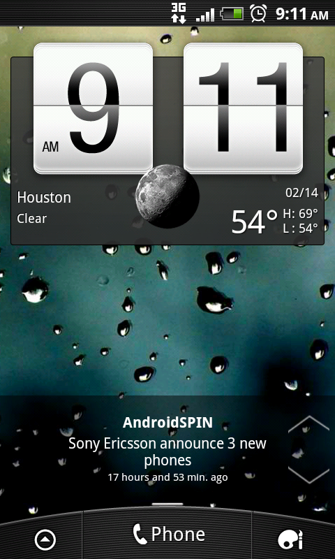
Playing along with the new “minimal” everything craze, we have another addition, and for once it’s not a clock, a calendar, or weather display. Minimal RSS Feeder is explained with just the title, it is what it says, and it works well.
After playing with the widget for a little while, I think it’s found a permanent place on my home screen. It’s very simple, straight to the point and easy to use. Don’t get me wrong usually you hear simple and you assume it’s just plain, which is not entirely the case, but considering it’s a minimalist app it’s kinda suppose to be.
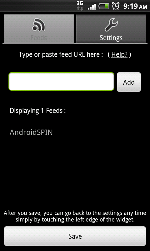
Minimal RSS Feeder places a RSS feed directly onto the screen of your choosing, allowing you a few customizations and multiple feed tracking. You can adjust the sync options for your feeder by:
- Refresh rate
- Auto scroll
- Scrolling speed
- Max entries
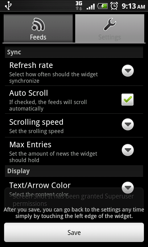
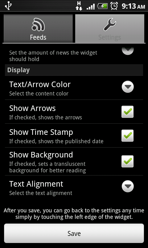
A few display options are also provided:
- Text/Arrow color
- Show/Hide arrows
- Show time stamp
- Show background
- Text alignment
Overall I personally like this widget seeing as having quick access to posts and such it’s relevant to the site. It does what it says and it does so while keeping that in a sleek, modern style that screams minimal.
Update:
Minimal RSS Widget v1.3
- v1.3
- Added new tab for Backup/Restore functions
- Added Max Items per Feed setting
- Wide Layout when arrows are hidden
- Square background
- Fixed many bugs and FC’s
- Cleaner code
[This widget is still being developed and improved, leave the developer some love or report any bugs/issues below or via the official thread. Development only succeeds when the community helps, developers can only catch so many issues until the app is running smoothly on their device, what may work for that device may not work as smooth on yours. As always feedback is highly encouraged.]
Summary and Downloads:
Application: Minimal RSS Feeder
Developer: Joaquim Vergès
Cost: FREE
