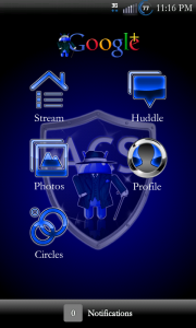
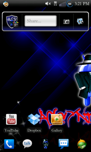
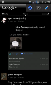
The inverted look of the Google+ app has been one of my favorite versions available so far. Like with many of the most used apps in the market, themers get to work and help provide many different options to us users. Sometimes they are better, sometimes they are worse. This is definitely better. Check it out –
 Â
  Â
  Â
  Â
 
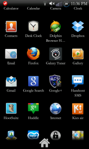
As you can see from the screen shots, it is a themed out using ACS’s website color scheme. It sports a themed widget, app icon and ever aspect of the internal workings. It is very clean and very slick looking. It should go extremely well with any blue or dark theme you may have installed. I am pretty sure it will go with anything and help add yet another element of uniqueness to your life.
To pick up this amazing rendition of the Google+ app, please visit ZHkilla’s forums thread at acsyndicate’s website. As always, be sure to thank him for his hard work and for sharing it with everyone.
Source: Android Creative Syndicate
