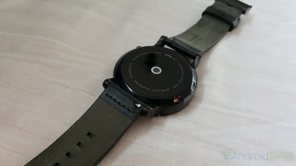
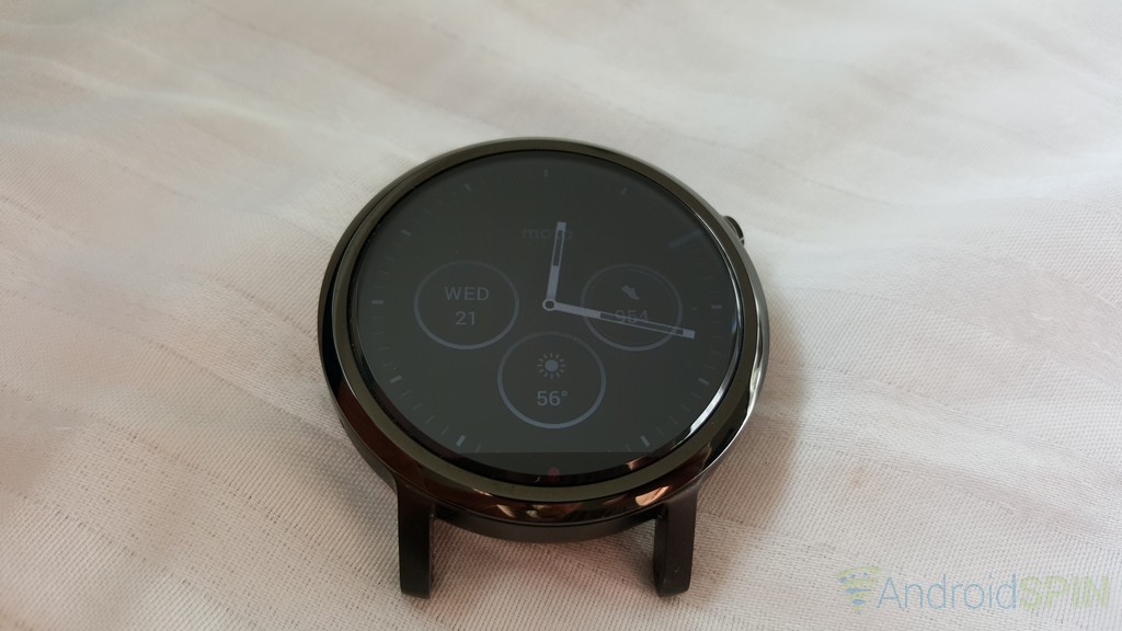
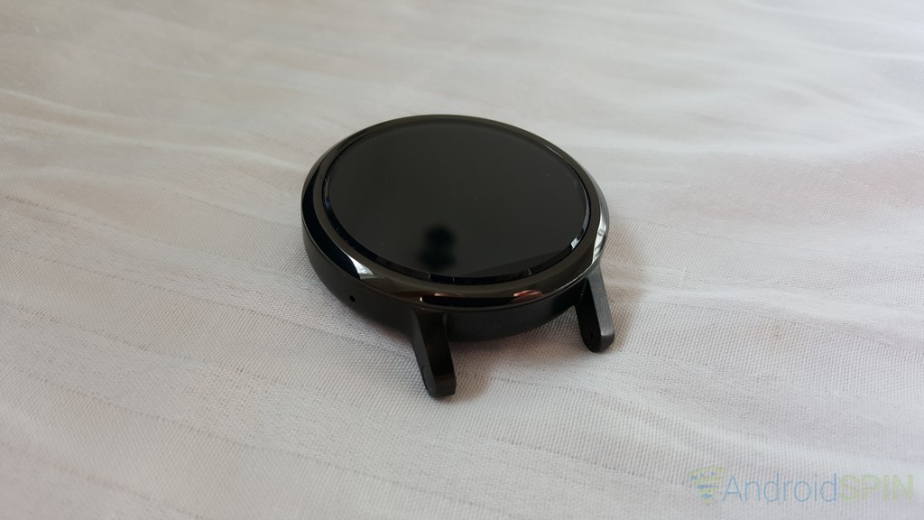
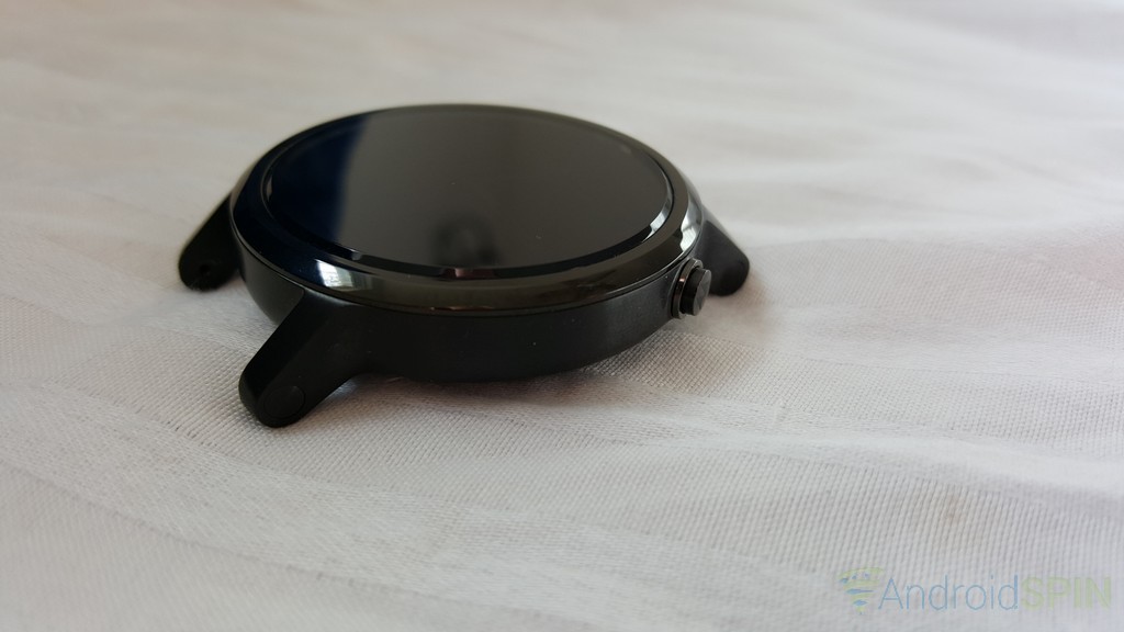
Motorola’s Android Wear-toting Moto 360 smartwatch is the watch the started it all about a year and a half ago. It was easily the watch to lust over and own. Now we have the much anticipated 2nd gen, or 2015, model from Motorola. While the changes are light years ahead of the competition, the changes with internal hardware, external looks and options certainly make it the next big Android Wear success from Motorola.
Over the last two weeks I have been given the opportunity to give the new Moto 360 a test run. To see how it performs, how it feels and how it fits into my life. Also, up until now I personally saw Android Wear, and any other platform that put a touch screen on my wrist, as unnecessary. That didn’t mean I didn’t think it was pretty cool. I also read plenty of complaints from end users over battery life, cracked backs, sluggish performance and various other issues that kept me at bay from wanting to get one. That also means the the Moto 360 2nd gen (2015) is my first true experience with Android Wear.
Specs:
Mens 42mm and Womens:
- 1.37-inch 263ppi (360 x 325) screen
- 300mAh battery
Mens 46mm:
- 1.56-inch 233ppi (360 x 330) screen
- 4000mAh battery
All variants:
- Qualcomm Snapdragon 400 quad-core 1.2GHz processor
- Adreno 305 with 450MHz GPU
- 512MB of RAM
- 4GB internal storage
- Bluetooth 4.0 Low Energy
- Wi-Fi 802.11 b/g
- Dual digital mics
Sensors:
- Accelerometer
- Ambient Light Sensor
- Gyroscope
- Vibration/Haptics engine
Critical design changes:
Not owning or using the first gen Moto 360 leaves me at a bit of a disadvantage compared to other reviewers out there. I do work in a retail store with a dummy unit and a number of associates have been kind enough to chime in with a few images for reference. The two most notable changes to the design from the 1st gen to the second gen are size options and how bands attach.
The Moto 360 now comes in two different housing sizes with three different watch band sizes. You have the Men’s 46mm housing which uses 22mm watch bands, a Men’s 42mm housing which uses a 20mm watch band and a Woman’s 42mm housing which uses a 16mm watch band. I chose the larger 46mm housing for my experience, even though I have smaller, more girlie wrists.
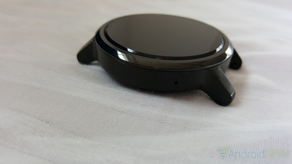
The physical size changes are accompanied by a more traditional watch band attachment set of arms that taper down off the housing. The previous model tucked the band up under the watch which resulted in a number of complaints and issues of stress fractures on the backside of the watch. The arms not only remove this issue, but make it extremely simple to change out bands.
Motorola also relocated the physical button that is found on the right hand side of the housing. Instead of sitting dead center it is now off set towards the top. Pressing the button when you need to feels natural with your index finger.
They also moved the mic hole closer to the bottom instead of dead center on the opposite side as well. I am sure this helps with recognition of your voice, but it also just makes more sense as it now faces your mouth directly.
Battery life:
Battery life is always a major concern for end users. Be it on your phone, tablet or smartwatch. We want our hard earned money to spent on products that not only do what we need or want them to do, but that can also keep up with our daily lives. The battery issues that plagued the first generation watches were resolved, for the most part, by software updates. However, they were still very much at the back of my mind when I gave the watch its first charge as my days are typically a lot longer than many. Motorola claims the 46mm variant will deliver 2 days of mixed use Ambient mode off and up to a full day of mixed use with Ambient mode on. Generally my days start at 6:30 a.m. and end between midnight and 1 a.m. Naturally I was concerned with the Moto 360 getting me through my day.
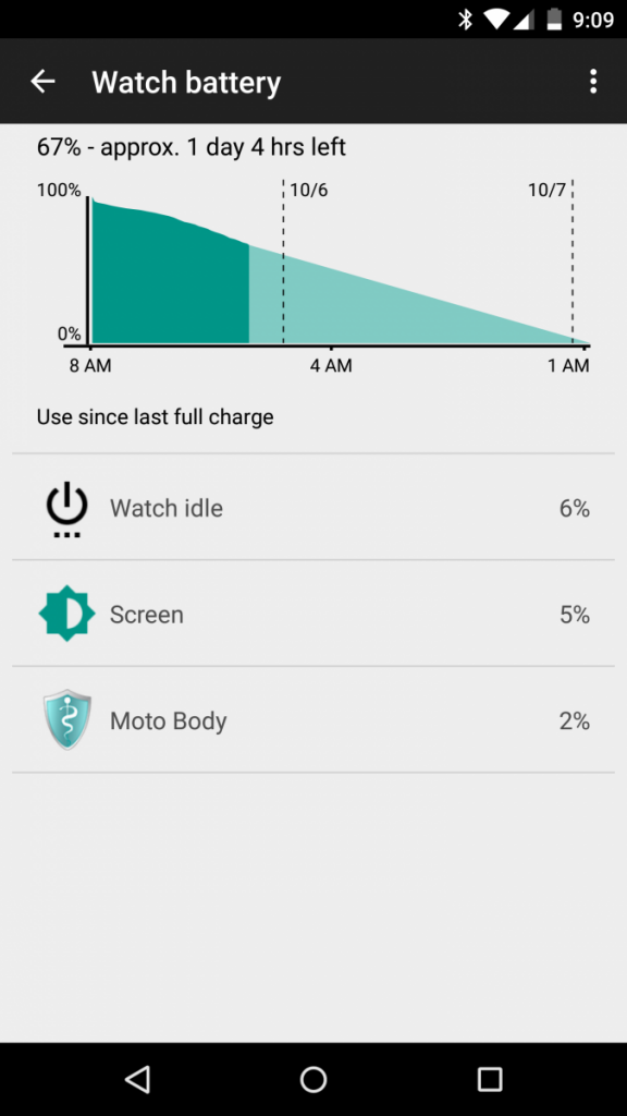 The first full day of use was on a Saturday and it started a bit later than usual, about 9 a.m. I left everything on, ambient mode (always-on screen), motion gestures, auto brightness and Wi-Fi. I also left all my notifications on. Well, at least calls, texts, hangouts, emails, G+ and whatever else is on by default. To my surprise I went to bed that evening around midnight with 68% battery remaining on the Moto 360.
The trend continued over the last two weeks. Many weekdays starting at 6:30 and ending around the same time, midnight or 1 a.m. There was not a single day that I ran into a dead watch before I was ready to call it a day. The most depleted I ever say the battery was 38% and that was because I showed it to a ton of people and did a ton of searches, commands and some navigation.
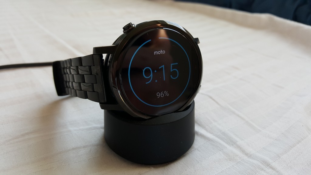
My battery concerns dropped to near zero when I placed it on the charging cradle and saw how fast it charged up. Going from 50% to 100% in just over an hour. Granted, the device uses a wireless charging cradle which could still leave you in a pickle if you didn’t bring it with you, or don’t have a second wireless charging cradle, or pad at the office or your friends house. Still, it is small enough to be portable. The added perk, it is Qi compatible so you could use just about any other Qi wireless charging pad in a pinch.
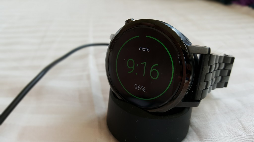
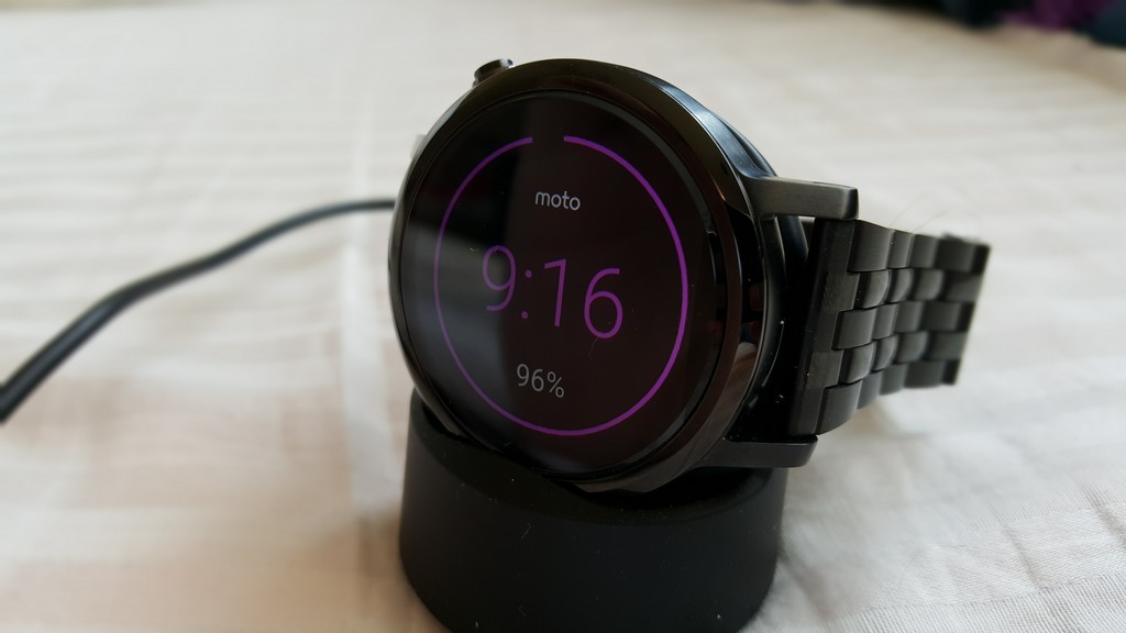
While it charges it also offers up a digital clock along with its power level. There is a battery level ring that goes around the face so you can see how how power you have as well as a percentage listed. Makes for a nice little bedside clock while powering up for the next day. Motorola also offers up the docked clock mode in a variety of colors. Simply swipe across the screen to flip through other color options. You can also change it through Moto Connect if you would rather. I personally like the blue, but there is green, red, yellow and purple.
User experience
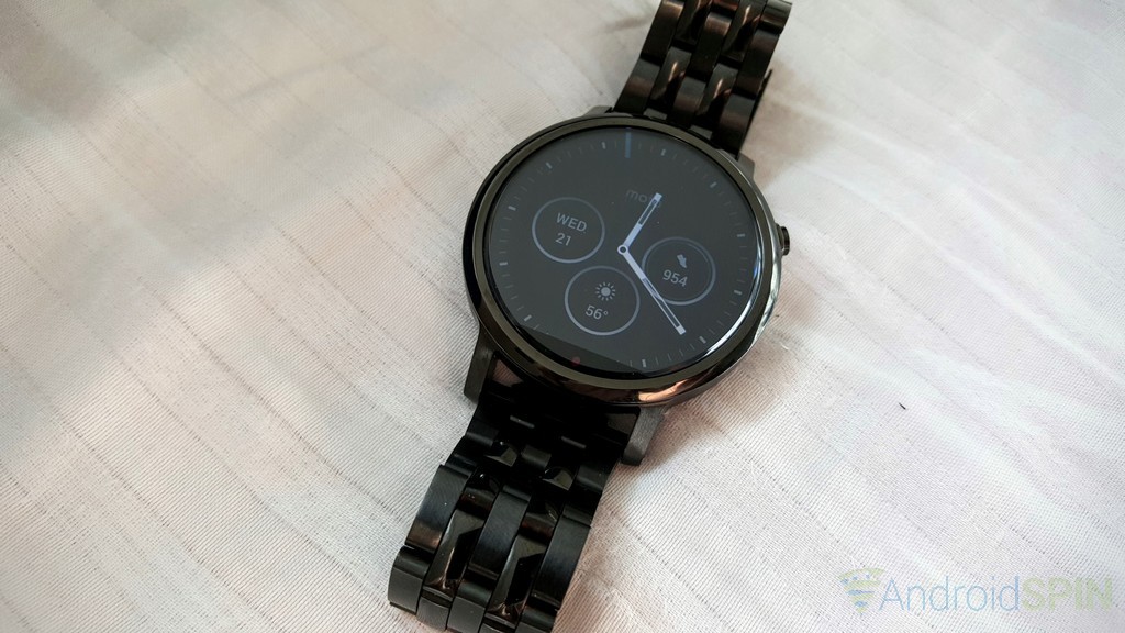
My understanding of Android Wear is that it is pretty much the same experience across all devices. They have access to many of the same apps and even watch faces. Motorola has the distinct addition of Moto Body as well as Moto Connect. The Moto Connect app offers up additional watch faces, Dock Mode, location settings and other related apps for your watch. The watch faces are designs from Motorola and are the same ones you can choose from when you create your watch through Moto Maker. Each one can be customized from the watch or from the app on your phone. you can alter colors and other aspects like clickable dials and things. It is very easy to use and user friendly.
Glancing at notification, swiping around the various screens and using actionable commands takes a little getting used to, but is fairly convenient. Android Wear is really all about the voice, not so much the touch interaction. While it still exists, much of what you will end up doing will require you to speak out loud to it, or open something on your phone from the watch. The speaking aspect is what takes the most getting used to if you don’t do it frequently with your phone now. I rarely used voice to search for anything, respond to messages, set reminders, play music or anything else. I am still “that” guy who does it all on my device. Since the Moto 360 is so voice centric to do things, I was forced more to start giving commands. I still feel a bit silly talking out loud to get things done, set and started, but it works damn near perfectly. More so the experience of seeing calls, text and other notifications at a glace is pleasurable and non intrusive to your daily routine.
Laggy?
The first gen Moto 360 was said to have a large amount off lag when doing various things on the watch. Some described it as unbearable, others said it was tolerable but left a bad taste in their mouth and prevented them from using the watch to its full potential. The new version of the watch has been met with less complaints and is said to be drastic improvement over the first edition. Not having the first one to compare against, I can only assume that the majority of users out there are speaking the truth. I can’t say here is no lag at all as there are times where I see it stutter or slow up on a transition. it isn’t 100% smooth as butter, but it doesn’t make things unusable. I do find myself jumping the gun on the “OK Google” command and not giving it enough time to start recognizing what I want to say.  Mostly because I am used to hearing the tone on the phone that lets me know Google is listening and you don’t get that with the watch. Once you get the timing down though, it isn’t an issue.
Overall thoughts from two weeks
From all the reviews and thoughts I have read from multiple sources, the conclusion seems to be the same: The new Moto 360 is more powerful, manages battery better, is snappier, looks amazing and offers up more design options to personalize how it looks than any other competitor. While this is my first Android Wear experience long term, I have to say, when I look at photos and dummy units of what else is out there, I am inclined to agree.
The watch looks great for any occasion and certainly draws some attention. Having a second screen that doesn’t require you to hold it frees up your hands to do other things. Having access to things like Google Keep, your agenda, your fitness and more keeps my phone from needing to be pulled out which alleviates screen on time and unnecessary battery drain. I think, while Motorola didn’t drastically change things, that they did a great job with the things they did change. It really is a compliment to your daily digital life.
If you are hesitant on buying into the smartwatch game because you don’t see the purpose in your life, you are really missing out on the convenience factor that one can bring to you. Especially one that looks this good and is so easy to use.
Personal notes:
- Be prepared to touch it ALOT. Â I find myself constantly staring at my wrist now and just ‘looking’ at the screen for no real reason. I also find myself flipping through the same notifications and not dismissing them just to do it.
- Be prepared to show it ALOT. While most people won’t immediately notice that you are wearing a smartwatch, the instant you get a call, text or notification the eyes will drift to your wrist. You could be a jackass and ignore the looks and interest, or you could stike up a conversation. I tend to strike up a conversation and set myself useless reminders to show how it works.
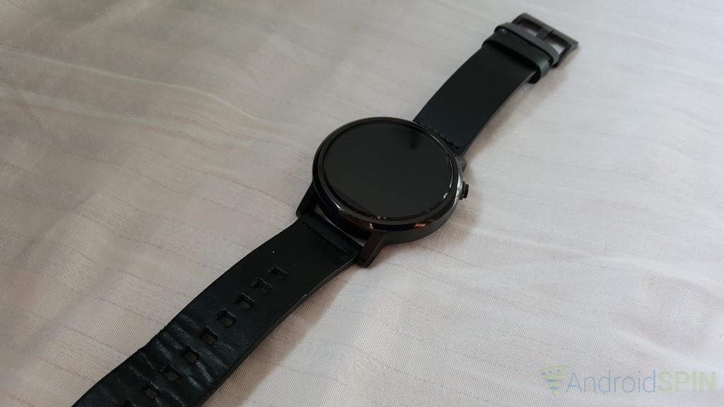
- Grab some different straps. I opted for the bare bones basic configurations of the Moto 360 with a black on black look. The black leather strap that comes as part of your purchase is nice, but isn’t ‘me’, if you know what I mean. It looks fine, keeps the watch on your wrist and works, but the way it flexes and creases drove me batty. You can opt for metal bands from Motorola for $50 in 3 colors.If you aren’t looking to spend the extra there are plenty of other options out there. Since the watch sports a standard 22mm watch band your options are only limited by your budget. I ran a search on Amazon and picked up an inexpensive black metal band that still offered the quick release system to make switching easy. It might not be the best one on the market, but it looks good with the black watch and fits well.
- Pay attention to your apps. Just like apps for your phone, some Android Wear watch faces or apps will do more harm than good. Don’t go hog wild the first week installing every watchface you see. Some don’t offer good looking Ambient display modes, some don’t offer ambient display modes at all and others are battery hogs that will give you a bad experience. Install 1 or 2 at a time and see how they look and run. If they drain quicker then uninstall them immediately and reboot the watch to get rid of it entirely.
I am certain that I am missing out on a lot more uses and capabilities. Hopefully I touched on things that others might have wondered about or questions though. I will do a few other small posts in the near future on how easy it is to change watch bands, change watch faces and check your activities with Moto Body. Until then, go get your order placed for the new Moto 360 through Moto Maker. Unless you are anti-watch, you will be pleased.
