Notifications. It is what we all love to get. When you hear that sound byte chime from your device, it is almost like Christmas morning. Okay, so that explanation my have been a bit much, but you see where I am getting at.
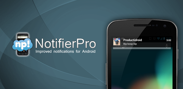
Notifier Pro is a nice little notification app I have been using for the past two months or so.The app has actually been around for a little while, and I feel it just adds to the Android experience. I am one of those that does not have their status bar displayed on the homescreen, so notifier pro was exactly what I was looking for.
Basically Notifier Pro just displays your notifications in a banner, on either the top[, bottom, or center of your screen. No matter what app you are in, the banner will show up once a notification is received, and it will give you the option to click on the banner to retrieve that notification. When first opening the app, you will have to access your accessibility settings to activate the service. You will then be able to choose which app notifications you want Notifier Pro to display.
Once you have the service activated, you will then go into your general settings to access themes, and overall appearance of the banner. There are about four themes that come with the app, but the Play Store has themes from the same developers, and some from other developers that you can choose from. Some are free themes, and some cost money. You also have the option to set vibration for all notifications, as well as set one ringtone for all of your notifications that are on your checklist. I chose not to use these settings, simply because I like different tones for different notifications. I can imagine a lot of you will feel the same way about this.
There are advanced options to Notifier Pro, that allow you to access your notifications through your lockscreen. You can set the banner to wake up your device, and allow it to be clickable through your lockscreen. Other advanced settings include, hide icon, swipe to launch, swipe to clear, and scrolling text. Scrolling text ressembles a ticker like animation when the message is fairly long. Swipe to clear acts just like swiping the notification in your drop down drawer.
There is a free version and paid version in the Play Store, so if you want to improve upon your notifications, I would suggest giving it a try. Also, check out my video review below to see it all in action. Let us know if you decided on downloading it, and how you like it. I wonder how many times I wrote notifications in the post.


