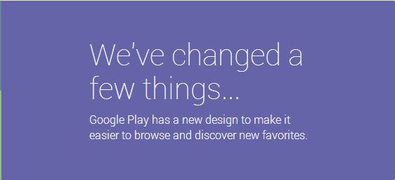
Looks like the Google Play Store on the web side of things got a bit of a make over today. The new layout is looking pretty sick with a better looking UI on the far left hand side to access Apps, Movies & Tv and the likes. Below that you now find a quick list of actions like My Wishlist, Redeem gift card, Buy gift card and Buy Google Play credit. It looks like a large majority of the redesign update is really aimed at movies, books, music and magazines. Focusing the online experience towards the digital consumer vs apps and games. That doesn’t mean they don’t highlight a the aforementioned, but I certainly do seem to be bombarded with more digital content then before on the front page.

What do you think of the new look? Do you see more digital content being pushed to the forefront? What do you think of the new design?
