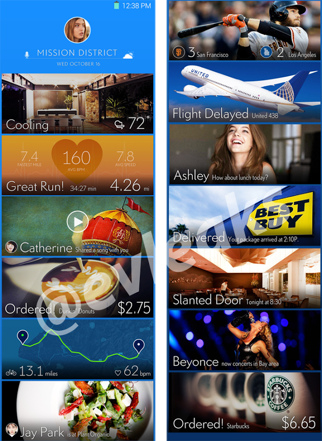
Looks like Samsung wants to change the game up a little bit, by changing their UI to something “somewhat” fresh. The image above comes from our leak king, evleaks, and it shows a Windows/Google Now-like style UI.
Very similar to Google Now, these “cards” will show you information to get you through your day, but they have also added a somewhat social element to this UI. I guess they are trying to simplify the user experience, which almost resembles HTC’s stab at trying to simplify feeds with Blinkfeed. Let us know what you think about this new Samsung revamped UI. Something you find appealing?
Source: evleaks


