Just yesterday we alerted everyone that Plex would be raising their monthly, yearly and lifetime rates on Plex Pass. I am sure at least some of you went out and grabbed the lifetime subscription immediately. If not, you only have a week left before prices go up. Today the Plex team has pushed out an update for the Plex Pass app for Android that offers a ton of stuff for us subscribing members to try out long before it goes to the standard paid for Plex app.
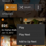
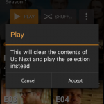
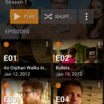
The big feature addition is currently called Play Queues. Similar to playlists, but distinctively different as playlists aren’t supported as of yet. A Play List would allow you to save it for future watching or listening. Play Queues will let you queue up, say the first season of your favorite show, and play them one after the other without needing to select the next episode manually after the current one ends. What tickles my fancy on this update is that Play Queues are supported on Chromecast.
Along with Play Queues there is also a new Post-Play screen that will grace your Chromecast screen or Plex Web App to let you know what is next on your list. It will only appear in certain situations, like if the video was less than 5 minutes the post-play screen won’t appear, it will just move on. If the video was less than 20 minutes long the Post=Play screen will appear and then automatically advance to the next video.
These considerations are designed to try and make things work smoothly for users in as many scenarios as possible. For instance, these considerations should help:
- avoid post-plays between very short clips, such as short home movies
- allow easy playback of a Play Queue of music videos
- allow continuous playback of a children’s television show to keep the kids occupied
- prevent having a whole television season get played through if you fall asleep
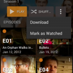
Along with Play Queues and the Post-Play screen there have been a number of fairly large UI enhancements. Plex redesigned the item grids and added larger art work, included a new toolbar for item actions, re-accented the entire app with orange vs the blue that was currently used, a new style for tabs and short-lived activities now appear as dialog on tablets.
As with all updates to the Plex Pass app, it only pertains to those that are Plex Pass subscribers. Generally a few weeks or months after things have been ironed out features and changes make it to the more standard paid app version of Plex. If you are a Plex Pass member, you might want to pick up the new update and see what you think. It does look pretty stellar, although I am not to sure how I feel about the larger media posters just yet.
