Everyone has heard of the iPad, but how about the competition? They’re all now slowly trickling in led by an onslaught of Android tablets, a single BlackBerry tablet, and rounding up the rear is an HP tablet.
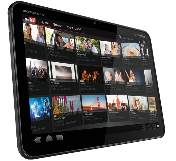
The first Android-based tablet was the Samsung Galaxy Tab, a 7″ device released towards the end of 2010. Unfortunately, the only thing that was “tablet-y†about it was the screen size. The software was identical to what ran on Android phones at the time, and that was simply no bueno. No screen optimization for apps, etc. Fast-forward a few months to 2011 and in comes our knight in shining armor – the long-awaited and “Best of CES 2011″ winner, Motorola XOOM. Now granted the XOOM tablet for Verizon has been out for several weeks, today marks the launch of their WiFi only version. I’d say due to the $800 price tag at Verizon (without contract, $600 with 2-yr), this WiFi version will be the more popular of the two.
First, the hardware. There is only one screen size offered, and that is the 10.1″. It’s bright and beautiful (and huge!) with a resolution of 1280 x 800. What this means is the display offers a “wide†viewing experience which allows for users to enjoy movies just like they do at home. To contrast, the iPad offers a resolution of 1024 x 768 which is akin to the old “letterbox†format. They’re each good in their own right and serve different purposes, but I do like the widescreen. The one drawback to it is the device is much longer than it is height-wise; holding it in portrait mode tends to feel a bit awkward and unbalanced. Cruising right along is the dual-core 1Ghz processor, and it’s FAAASSSSSST! Flicking through screens, within applications, books, and web browser yields no lag whatsoever. A breath of fresh air. This experience is also attributed to the 1GB of RAM inside, which dictates how many applications can be open at once essentially. This is the most found on any Android device. So…applications and data. 32GB of storage space is included inside the XOOM, with a microSD card at the ready to support and additional 32GB if the user desires. There are two speakers on the back providing a crisp but could-be-louder stereo sound. The cameras also come in pairs with a 5MP in the back and 2MP on the front for a stellar video chatting experience. In Motorola style, the rear camera also carries a TWO flashes, for when one really needs to light up a room. At the bottom is a microUSB port for transferring data, mini-HDMI port (cable is sold separately) to mirror the device image onto a television, and a pinhole port for charging the device via Moto’s own proprietary charger. That really bugs me, as most devices (excluding Apple’s) are all able to charge via microUSB. I’m wondering whether more power can go through this type of charger than microUSB, as Samsung’s Galaxy Tab also had its own 30-pin dock connector for charging. It’s a bummer for the sole purpose of carrying and losing yet another cable. Lastly, there are two gold connectors for Moto’s own accessories (keyboards, etc.). Internally the only network connections available are WiFi and Bluetooth, and a GPS chip which I’m most grateful for. Some of the newer tablets won’t have GPS unless they’re the 3g/4g carrier version – boo! Overall, I love the internals!
Software time! This latest tablet-only Android OS is called 3.0 (aka Honeycomb or HC for simplified purposes). Because Google created HC with one intention, the result is a simple and clean, fluid and elegant interface. The details were given some good attention and it’s clear that Google has studied its competition for what works and what doesn’t. Gone from tablets are the hardware buttons (home, back, search, menu) and instead, they’ve been integrated into a lower menu on the OS. Elegant is the only word I can think of to describe the look. With regards to functionality, there isn’t much extra that HC does than Gingerbread or Froyo (the previous two OSes), but 3.0 is very much a leap I’d say. The next step is for Google to work with developers in getting apps up to speed for native tablet use.
Alright, so my impressions. The XOOM is fast, no doubts about it. I like the size for television and movie watching, but I can also appreciate a 7″ or 8″ display since they excel at exactly the same as their larger brethren. Upon taking the XOOM out of the box with one hand, I nearly dropped it right back in. My wrist didn’t anticipate what 1.6lbs (730g) felt like when uneven in the hand. After getting a better grip (this time using both hands), my thinking was that it was just too heavy when holding for long periods of time without any support. My idea of a tablet is multi-functionality. I want to watch movies, listen to music, and read books, all in addition to using the various available apps. Comparing the XOOM’s weight to iPad 2 (1.33 lbs) and iPad 1 (1.56 lbs), while the numbers have a small difference on paper, the .3 lbs can make a big difference when reading for an hour straight. My friends who know me also know my technique; I chastise the guts out of these devices. It’s good to be critical when one will be using a device for at least a year on a daily basis. However besides the weight, I can’t think of too much else to knock! That of course is a wonderful thing. It can be a potential make-or-break for me as an endless line of tablets are due out by summertime, but that’s where a 14-day return policy comes in handy. I’ll be able to make a healthy decision by then. Now the only thing left is for the battery to last as promised (up to 10 hours).
Submitted By: Allen Schneider


