Google went on a massive roll for a number of weeks that had all of us looking forward to Wednesday for Google app updates. The last few weeks have been a bit more scattered sadly, but Google keeps updating apps. That is the most important thing, right? Today’s staged roll out moves Google+ to version 4.6 and it brings in a number of visual changes.
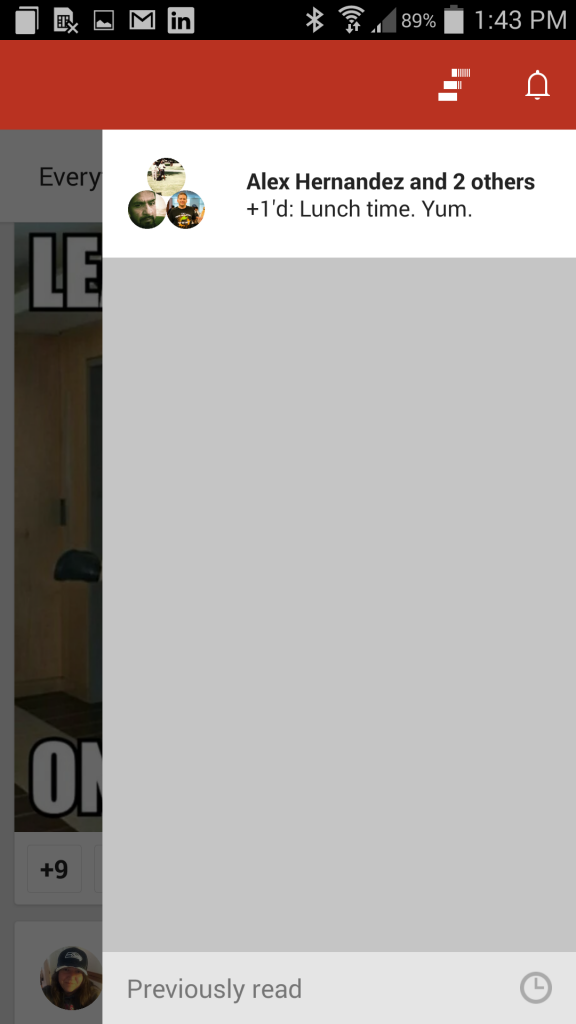
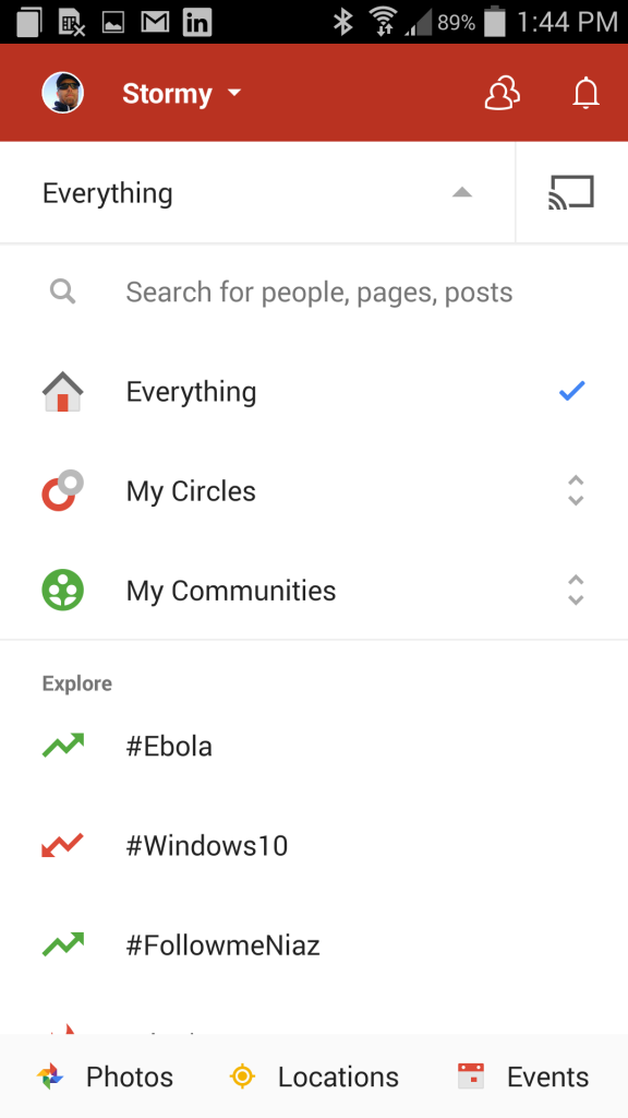
The first thing you might notice is that “write a post” button is no longer white with a red pencil, it has been inverted to be red with a white pencil. The red banner bar at the top is a more vibrant red as compared to the deeper red that it once was. Check out some screens. Old Google+ images are on the top with the new update images below them for comparison.


The homescreen icon also got a make over. It is now flat with a drop shadow on the G versus the previous 3D looking block that the Google Search app still offers. I assume all the Google app related icons will be getting the more flat look in their next updates.
The update is working its way across devices everywhere, but we know you don’t like to wait. Head over to Gappsearly and pick up the updated apk and get it installed now.


