If you keep up with Android news you should be very familar with the surveying done over at Nielsen Company as they’re usually the basis of consumer reviews for most when looking for statistics referencing the Android vs Apple disputes. Today they bring us a new survey showing customer preference and it’s effect on market share from July-September 2010 and January-March of 2011.
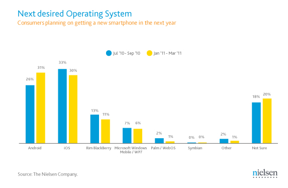 As seen by the chart above it’s clear that iOS with a 33% lead as the smartphone of choice in that stated period of 2010 with Android trailing by a mere 7% while sitting at 26%. You’ll notice that in the first period of 2011 Android was back on top, although not by much weighing in at 31% with iOS sitting at 30%.
One of the interesting things about this graph is seen at the far right. You see a good quarter of the people polled that have no idea what they want, which could translate to a higher market share for Android or possibly for iOS. You may notice that RIM still hold a part of the market coming in at 13% in 2010 and 11% in 2011, which is most likely do to the fact that no new innovations have been accomplished by them. Perhaps these new Blackberry-like Android devices are the reason for this, who knows.
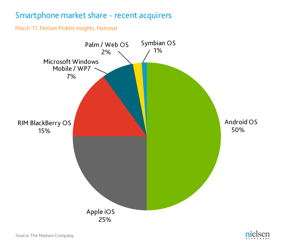
The pie graph above shows the actual sales that occurred, which you may find interesting. People were surveyed in March and among those that had bout a device in the last 6 months over half said the device was running the Android OS. These result may come as a surprise to some as iOS only came in at 25% with RIM trailing behind at 15%.
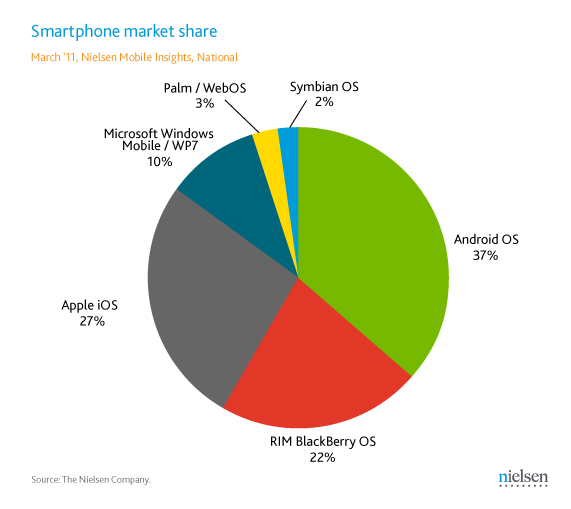
This last representation shows the installed base of smartphone consumers. One again Android comes out ahead at 37% maintaining a lead over iOS by 10%. What’s really surprising about this graph is despite the fact that the first graph shows that Blackberry is not as desirable as iOS or Android, they’re still in the game with 22% of smart phone devices as of March 2011 running some form of the Blackberry OS. What’s even stranger about that is they only trail iOS which sits at %27 by 4%.
Android’s climb to fame may not have been as noticable as iOS, but as seen in graph after graph, Apple devices are a big hit with users looking to upgrade there current ones. After the initial launch after all the current Apple fans have their new Apple device, they sales go back down and level out. This is not seen by Android, initial sales of a powerhouse device may cause a jump in sales which my be followed by a suddenly drop, but they change. The big difference is Apple drops and establishes a base line until another device gets released, Android steadily climbs.
Source: Mobile Burn
