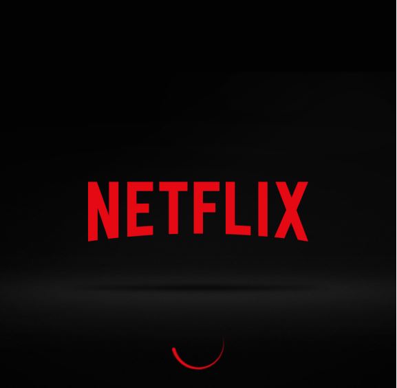
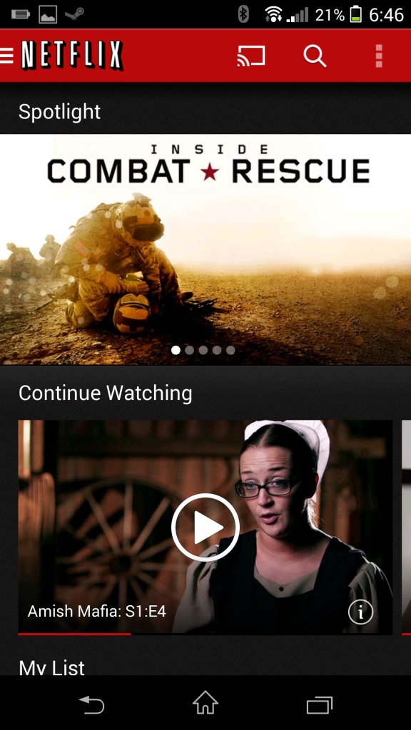
The Netflix app on Android received an update this evening. It brings the app to version 3.6. There are a whole lot of changes to be had in the update, but there were some visual tweaks that I thought you might to know about. The first thing you will notice is that the app icon has changed. Instead of the red square with white writing, you now have a white square with red writing. When you are used to looking for the red square for Netflix, this can through you off a little at first. The initial loading screen has gone from red to black as well.


Old on the left, new on the right
While the UI changes are small, they are dramatic enough to be very noticeable to an avid Netflix user and could through you for a loop when you load it up for the first time after the update. Netflix also claims there have been some bug fixes included as well, but don’t lead on to what bugs they fixed. We were hoping that it would start the next episode through Chromecast and they just didn’t say so, but sadly, it doesn’t. Hopefully that is coming soon.
Hit up the Play Store and grab the new Netflix update at your leisure. Feel free to cut out a click and just use the link below to head straight in. (The icon hasn’t changed on playboard just yet)


