Dear HTC,
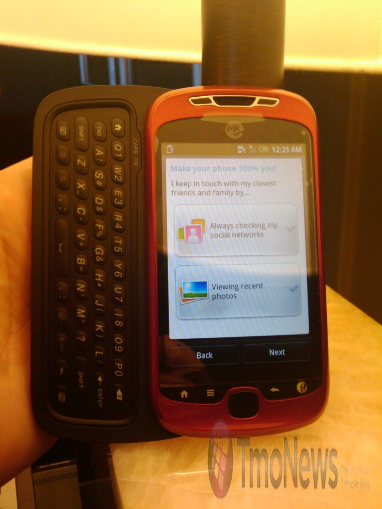
As you have noticed, the internet has been buzzing today with shots of your MyTouch Slide, aka HTC Espresso. I don’t know if you wanted photos of that device to be public yet, but what’s done is done.
A lot of people still carry G1s, and I have to assume since it’s still for sale, a fair number of people are buying them. Â We do love our G1s, but they’re getting old and already can’t match your other new phones like Incredible or Evo. We could have moved on long ago, but we really, really love a keyboard, a G1 keyboard in particular. We are so happy with it that we have passed on your other models, waiting for THE ONE to come along. Â You know, that phone that’s running Android 2.1 out of the box, that’s loaded with all the features the new phones have, as well as a nice keyboard that satisfies our desire to feel the button.
If what we have seen is the finished product, allow me to sum up what many people have said today in two simple words: I’ll pass.
Let me elaborate. It’s not the software that is the issue, Â the OS is everything we love and have come to expect from Android. It’s the external design that you’re hearing the collective sighs of disappointment. I almost don’t know where to start, but let’s first examine the big draw: the keyboard. It’s awful. While the keypad on G1 was embedded under the body of the phone, this one appears to be a tray that snaps in. I don’t know the reasoning for this, as it seems to take up a lot more space, as does the larger size and placement of keys. Were there a lot of complaints about key size? Even if there were, there has to be a better layout. And I’m just going to pretend that top row doesn’t exist. Â As it stands, the keyboard as a whole just looks cheap.
Speaking of cheap, let’s move on to the navigator button, circa HTC Touch. A feature that was used even before G1 came out. When your current devices are utilizing translucent balls or optical trackpads, that square pad feels like a bad trip to the past. I can only ask: why?
Why is also what I’m thinking when I look at the button on the far right. A stylized G? I always get the feeling when a standard thing is given a flashy makeover, it’s either to hide a flaw or to try to appeal to a group outside the normal demographic. Either way, I’m not liking it.
As a whole, MyTouch Slide just doesn’t seem to fit in with what you’re producing these days. Â I still hold hope these design issues will be resolved by the time Slide hits the market. If not, I’ll still be clutching my G1 until a real upgrade comes along, Â or it dies and I’m forced to make a choice I might not be entirely happy with. I hope it doesn’t come to that.
Sincerely,
Jolie Gendel


