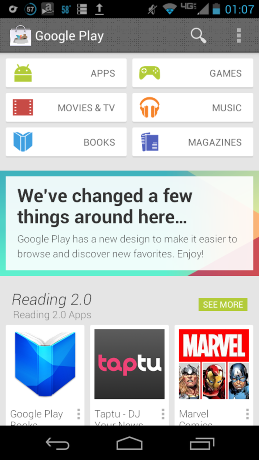
The Google Play Store version 4.0 is almost among us, and a couple weeks ago, a couple of Android websites got to play with a beta build. Today, we get a screenshot of the new front page. This screenshot comes courtesy of Eileen Rivera, who posted the screenshot on her Google+ page. She probably was not suppose to that, because now she has removed the image.
In the screenshot above, you can see what the new front page layout is going to consist of. A new, and simplistic design is what they are going for, and if you notice the Play Store logo has gotten a makeover. Seems that the logo sits in a dog bowl along with a bone, and this has something to do with the term “Dogfooding“. Dogfooding is a term Google uses denote internal beta testing. It is an interesting term, and I actually kind of like the logo change. The action bar has a weird pixel design, that is not too pleasing to the eyes, but it is something different. Let us know what you guys think about this screenshot.
Source: Android Police


