Often times we find our selves using an app that we absolutely adore but we wish the color scheme was different. Google+ fits into this category for me. I love the app but why on earth did they use so much white? I was expecting more with Googles colorful past to at least use something more appealing for a background for the UI. Fear not, that is what we have devs for right?
XDA member santiemanuel has taken and re-themed the app the way I imagined it should have been. Take a look at his GoogleKrad+ version.
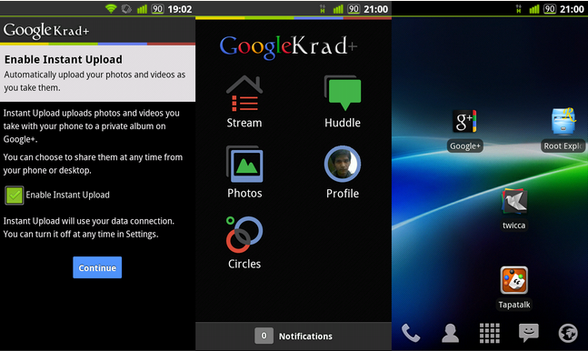
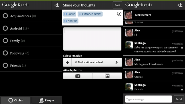
As you can see he has nearly inverted everything. There have been a few changes since these screens were taken, but the second set of screen shots just seemed messy with all the blackouts of personal info. Be sure to uninstall the original Google+ app before you install this modified version. Also be sure to check back with the thread when ever the main app gets an update. Go pick it up now.Â
Thanks a ton santiemanuel. I know we all appreciate all the time and effort you put into making this look so much sleeker. Be sure to thank him guys!
Source: XDA
