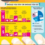
Well after a lot of research,  MobileUnlocked has created a UK mobile phone network infographic answering all these questions and more. (Be sure to click on the image to get to the full size version.)
According to their information, O2 is by far the most popular network, currently holding 20% of the mobile market, with most people looking to switch to them. If this were to happen, O2 would become the biggest mobile network operator in the country, massively dwarfing the others.
The UK mobile phone network infographic also goes on the show that most people who want to switch, can’t, because they are still locked into contracts with other networks. Â I believe this is due to most networks only offering 24 month contracts for new mobile phones, and making it very difficult to leave. The exception to this is O2’s new Refresh Tariff, which I applaud.
I love infographics, and I wish there were more like one, showing customers and potential customers relevant information about the state of the mobile networks in the UK rather than just spewing numbers at them.
If your in the UK, what are your views on this information, and what network are you with and why?


