![]() Most all the Google apps have had an update to their UI graphics the last few months, but many of them appear to only have a partial update to the guidelines laid out for Material Design apps. Chief among these partial updates has been the Google Hangouts app which did get quite a big change to its look but still has a few changes to come, mainly to do with its side bar which in no way resembles the Material Design slide out menu in Google’s other apps. Well, it looks like we’re going to get a sneak peek today of Material Design for Google Hangouts after Android Police managed to get their hands on some screenshots.
Most all the Google apps have had an update to their UI graphics the last few months, but many of them appear to only have a partial update to the guidelines laid out for Material Design apps. Chief among these partial updates has been the Google Hangouts app which did get quite a big change to its look but still has a few changes to come, mainly to do with its side bar which in no way resembles the Material Design slide out menu in Google’s other apps. Well, it looks like we’re going to get a sneak peek today of Material Design for Google Hangouts after Android Police managed to get their hands on some screenshots.
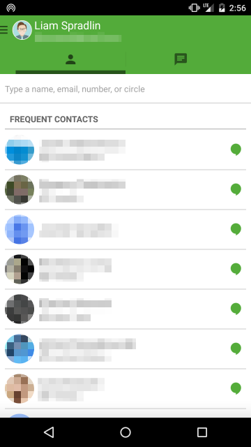
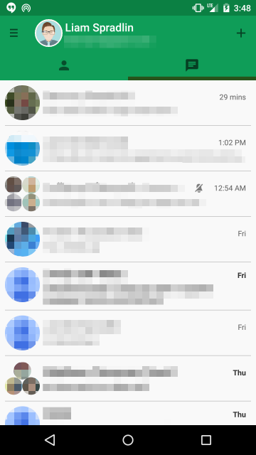
We have yet another change to Hangouts‘ primary colour, a slightly different hue of green (old: left, new: right):
What do you think about Material Design for Google Hangouts? Let us know your thoughts in the comments below.
Source: Android Police