If you were like me, you wondered why Google decided to go with white status bar icons in Android 4.4 instead of the normal Holo blue. I was saddened to see that pretty blue color go away, but since running this first KitKat build for my HTC One, I’ve adapted to the new color.
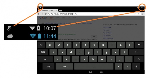
Some of you probably also noticed that the arrows that indicate data flow to your phone, were also missing from the status bar. Just a minor detail, but it is actually not missing from Android 4.4, they just placed those arrows in the quick settings tiles in your notification bar. Google’s Dan Sadler went to his G+ page to answer this little questions we had, and to let us know it all happened for a reason.
Seems like this is as good a place as any to explain the changes to the system status icon colors in KK.
1. Whiten ALL the status bar icons! Aesthetic concerns definitely factored into this (as has been mentioned elsewhere, a more neutral SystemUI allows apps to manage their own color palettes a bit better), but also keep in mind that with the new translucent bars feature, the color became a usability problem. Good old 33b5e5 doesn’t pop as well on top of random wallpapers, even with the background protection.
2. What about theÂ
MCS GCM indicator? +Liam Spradlin basically called it: “Overall, network connectivity has been made strangely more opaque in KitKat, though for many average users this isn’t a huge concern.†In fact,most users find the colors confusing, if they notice them at all. Even the vanishingly small fraction of users who understood what the gray meant only really looked for it when things weren’t working right; now you and I just have to remember to actually pop into quick settings to look for things like GCM liveness (orange is the new gray) and in/out indicators. Which brings me to…3. B—BUT MY BLINKENLIGHTS?! So this (the removal of the little in/out data traffic arrows from the RSSI) was mostly a performance consideration, believe it or not. The way the data bits are bubbled up and drawn was not only causing a ton of extra rendering work, but actually forcing a layout (!) in the status bar as well. We could have more aggressively cached the bitmaps (rather than creating new BitmapDrawables from resource IDs every time, which was causing the relayout) but that would still have left all the drawing—multiple times per second in some cases—sucking away precious CPU and GPU from your game or Launcher animations or whatever. In the end it seemed like a lot of work (and battery) for what was effectively visual noise, so this too was booted to Quick Settings where it would be available for us nerds.
It all makes sense, and if changing the icons makes the Android experience that much better, then I’m on board with it. Let us know what you think about the change.
Source: Phandroid